Key Takeaways
- The CSS reveal animation can be created using only the
element, without the need for any extra elements or pseudo-elements, by manipulating padding, background color, and image positioning.
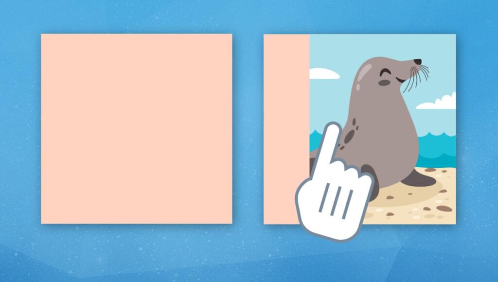
- The key to the reveal animation is to add padding to the image, then gradually reduce it to zero on hover, while using a background color to create the illusion of the image being revealed. The ‘object-fit: cover’ and ‘object-position: right’ properties are used to maintain the image’s aspect ratio and prevent it from moving during the animation.
- The reveal animation can be extended to create more variations by manipulating the padding from different sides. The ‘object-fit: none’ property can also be used in certain configurations to create different effects, but it requires the CSS width and height to match the intrinsic dimension of the image.
In this article, we’ll explore some CSS tricks that allow us to create a hover animation for revealing our images.
We might be thinking “Well, that’s an easy task! An extra element above the image that you animate and it’s done.” True, but we won’t use any extra element or pseudo-element. We’re going to work using only the <img> element. Nothing more!
It may sound impossible because, using only the image element, we can’t have something above it. Indeed, we won’t have something above it, but we will fake it!
Below is a CodePen demo of what we’re going to explore together.
See the Pen
A reveal hover effect with one element by Temani Afif (@t_afif)
on CodePen.
Cool, right? A reveal animation using only a few lines of code and no extra element. Follow me, and let’s dissect the magic behind the code.
The Initial Configuration
We’ll start by defining the size of the image:
img {
  --s: 200px; /* the image size */

  width: var(--s);
  height: var(--s);
  box-sizing: border-box;
}
Nothing complex so far. We’re using a square image for simplicity, but it can be an image of any dimension. It’s important to explicitly set width and height and not use aspect-ratio or leave the default size of the image. This is mandatory for our animation, and we’ll see why later.
Note the use of box-sizing: border-box as well, which is also important. It has no effect for now, but let’s move to the next step to understand why it’s needed.
Adding Some Padding
What will happen if we add some padding to an image where we’ve defined a fixed dimension and we’ve used box-sizing: border-box? Let’s try!
See the Pen
Untitled by Temani Afif (@t_afif)
on CodePen.
The image is squished, as we can see in the above demo. We add 100px of padding on the left, which will leave only 100px of space for the image (the content-area). That’s the effect of box-sizing: border-box.
As explained by MDN:
border-boxtells the browser to account for any border and padding in the values you specify for an element’s width and height. If you set an element’s width to 100 pixels, that 100 pixels will include any border or padding you added, and the content box will shrink to absorb that extra width.
Now, imagine a situation where the padding is equal to the width. Yes, the image will disappear! In the demo below, hover over the image and see the result.
See the Pen
Animating the padding by Temani Afif (@t_afif)
on CodePen.
There are two things in particular to note in the above demo. Padding can be animated, which is cool, and we can see the importance of the CSS variable we used previously to define the size of the image. We’ve used the same variable to define the padding, so we don’t have to repeat the same value.
Adding a Background Color
Let’s take the previous example and add a background to it.
See the Pen
Untitled by Temani Afif (@t_afif)
on CodePen.
We’re starting to get somewhere now. The background will logically cover the whole element. We don’t see it under the image (unless we use one with transparency), but we see it on the padding area.
Our goal is to reveal the image, so let’s start by having the padding and then making it 0 on hover — the opposite of what we currently have.
See the Pen
Untitled by Temani Afif (@t_afif)
on CodePen.
This still isn’t what we’re aiming for, but we’re getting closer! We’re missing only one ingredient to make our “fake” reveal animation perfect!
Adding object-fit and object-position
The missing part is to avoid the squishing of the image, and here comes the final trick. We’re going to use object-fit with the cover value.
As explained by MDN:
The replaced content is sized to maintain its aspect ratio while filling the element’s entire content box. If the object’s aspect ratio does not match the aspect ratio of its box, then the object will be clipped to fit.
Two parts are important here:
- “The replaced content is sized to maintain its aspect ratio”. This means that the image won’t get squished but will keep its intrinsic ratio. We used a square image, so it will remain square.
- “filling the element’s entire content box … will be clipped to fit”. The image should fill all the content area (the area we reduce by adding some padding), but if it won’t fit inside, we clip it.
Let’s try this in the following demo.
See the Pen
Untitled by Temani Afif (@t_afif)
on CodePen.
See that? The image is no longer squished! It’s keeping its ratio inside the content area while we add/remove the padding.
Okay, so we may be thinking that the effect isn’t the same as in the initial demo. The image is moving strangely. True. So now we turn to object-position. The default value is center, so the image will be centered in the content area all the time and will get clipped to fit inside. That’s why it moves with the animation.
What we’ll do next should be easy to predict. We’ll change the position to make sure the image won’t move. We’ll add the padding from the left, so we should fix the position of the image to the right using object-position: right.
See the Pen
Untitled by Temani Afif (@t_afif)
on CodePen.
Our reveal animation is done! We didn’t need any overlay or an extra element above the image. By using a simple background color, along with some positioning tricks for the image, we get a fancy reveal animation with a small amount of simple code.
We can easily update the direction by adjusting the padding direction and the object-position. Here’s the first demo from earlier, which includes the four directions.
See the Pen
A reveal hover effect with one element by Temani Afif (@t_afif)
on CodePen.
Here’s the CSS we’re using:
img {
  --s: 200px; /* the image size */

  width: var(--s);
  height: var(--s);
  box-sizing: border-box;
  object-fit: cover;
  cursor: pointer;
  transition: .5s;
}

img.left {
  object-position: right;
  padding-left: var(--s);
  background: #542437;
}

img.right {
  object-position: left;
  padding-right: var(--s);
  background: #8A9B0F;
}

img.top {
  object-position: bottom;
  padding-top: var(--s);
  background: #E94E77;
}

img.bottom {
  object-position: top;
  padding-bottom: var(--s);
  background: #7A6A53;
}

img:hover {
  padding: 0;
}
More Reveal Animations
We can extend the trick to create more variations using the same idea. Instead of adding/removing the padding from one side, we can do it for two sides or even all sides.
See the Pen
A reveal hover effect with one element II by Temani Afif (@t_afif)
on CodePen.
If we inspect the code of the demo above, we won’t find a big difference from the previous one. All that we’re doing is setting different padding configurations to create more variation for the same effect.
There’s one trick in the first and last example where we’re using object-fit: none instead of object-fit: cover. In those cases, the padding will reduce the width and the height of the content area to 0, while in all the others cases, we either reduce the height or width. In such configurations, cover won’t work, but none can do the job.
MDN states:
The replaced content is not resized.
Why aren’t we just using none in all cases? We can use it, and it works, but it has a small drawback. none will consider the intrinsic dimension of the image, so we’re obliged to have the CSS width and height equal to the intrinsic dimension for the trick to work. cover, on the other hand, keeps only the ratio of the image and will resize it to fit the area, so we can safely define any CSS size for the images.
Here’s a comparison so we can see the difference.
See the Pen
Untitled by Temani Afif (@t_afif)
on CodePen.
In both cases, we have the reveal animation, but when using object-fit: none, the image isn’t resized and is keeping its default size (500x500), which isn’t good. object-fit: cover is only keeping the ratio and will resize the image to fit the box dimension.
Conclusion
I hope you enjoyed this little CSS experiment. Using simple tricks and a few lines of code, we achieved a cool reveal animation with only the <img> element. We also did many variations using the same code structure.
We can do even more with this trick. I’ll leave you with a last example where I transform black and white images into colored ones on hover.
See the Pen
Color your image with a sliding hover effect by Temani Afif (@t_afif)
on CodePen.
I’ll let you continue the exploration and try to find more fancy animations!
